Show graph of average temperature in 24hours
Example: Show graph of average temperature in 24hours
Task
How to show temperature of the last 24h in graphs, in 24 points? Taking into account that temperature object is being updated more frequently..
Event script which make storage of temperatures
- -- current temperature value
- value = knxdatatype.decode(event.datahex, dt.float16)
-
- -- number of stored values
- count = storage.get('avg_count', 0) + 1
- -- sum of all stored values
- value = value + storage.get('avg_value', 0)
-
- -- save new values
- storage.set('avg_count', count)
- storage.set('avg_value', value)
Scheduled script which calculates the average temperature of last hour and writes it into KNX group address
- -- get current values
- count = storage.get('avg_count', 0)
- value = storage.get('avg_value', 0)
-
- -- check if there is at least one value stored
- if count > 0 then
- -- write average value to the required group address
- grp.write('11/7/19', (value / count), dt.float16)
- end
-
- -- reset storage
- storage.set('avg_count', 0)
- storage.set('avg_value', 0)
Make Graph
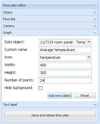
- Go to Visualization tab, then press on the Unlock current floor plan for editing. In the Graph section, choose the created object with group address ’11/7/19′, choose graph width/height, number of points
 .
.
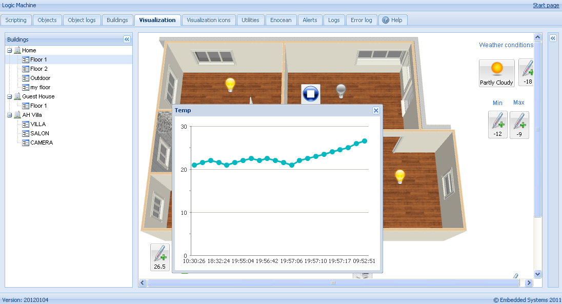
- When clicking on the newly created KNX object after 24 hours, it looks like this


